During my trip to Alabama earlier this year I visited among other an unusual but culturally significant point of interest: a supermarket. Specifically, I joined the host of my stay in Alabama, Andy Billings, on a trip to a Publix store.
Always the inquisitive type, I armed myself with a camera, eager to discover and document where the Homo Americanus fetches its food. Almost immediately upon entering the store, a stern-looking store manager approached and asked why I carried a camera. Andy, the “tour guide,” explained that we were tourists from Slovenia willing to see a real-life American supermarket. The manager, reassured, explained they are wary of business competitors trying to sneak a peek of their operations; tourists, however, were welcome to enjoy the experience and even take pictures.
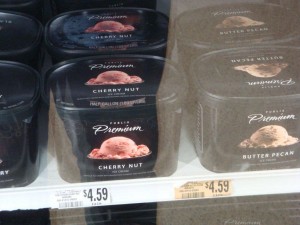
While touring the frozen products aisles I came across the Publix Premium ice cream:

Cartons of Publix Premium ice cream. click to enlarge. Photo: Simon Ličen
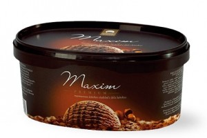
The carton design, especially when combined with the name of the brand, looked surprisingly familiar! This is the carton design of Maxim Premium Ice Cream produced by Ljubljanske mlekarne, a Slovenian corporation that processes milk and produces dairy products:

A carton of Maxim Premium ice cream. Click to enlarge. Photo: Ljubljanske mlekarne corporate website
While the designs are obviously not exactly the same, they do bear a striking resemblance in the picture presentation of the ice cream, the “Premium” brand and even the script typeface used to spell out “Premium” and “Maxim,” respectively.
Intrigued, I emailed both corporations and asked when had the carton designs been adopted and how long had the corporation been using them.
Publix Customer Care was the first to reply as I received their response on the next business day. Their reply, however, was not particularly enlightening: “As a privately held company, we are limited in what we share. Your question on the graphic design of our Publix brand ice cream packaging falls in the realm of propriety information,” read the message.
It took Ljubljanske mlekarne almost three weeks to reply; but when they finally did, their director of corporate communication was considerably more eloquent about the features of Maxim Premium. She explained that the Maxim Premium brand was launched in 1995 while the current design of the packaging was introduced in 2003. She added that Futura, a Slovenian advertising agency, helped with the revamp.
Publix’s evasive reply and the fact that Ljubljanske mlekarne has been adopting the same packaging design for the past nine years seem to be clues in favor of Maxim Premium’s seniority. Mere clues, however, are not enough to be able to demonstrate who—if anyone at all—copied the packaging design; I leave it to the readers to decide. While summer lasts on the northern hemisphere, it might be a good idea to enjoy both—or either one is within reach.
About Simon Ličen
Simon Ličen is a researcher, lecturer and author in sport, media and communication.
Ice Cream Plagiarism?
During my trip to Alabama earlier this year I visited among other an unusual but culturally significant point of interest: a supermarket. Specifically, I joined the host of my stay in Alabama, Andy Billings, on a trip to a Publix store.
Always the inquisitive type, I armed myself with a camera, eager to discover and document where the Homo Americanus fetches its food. Almost immediately upon entering the store, a stern-looking store manager approached and asked why I carried a camera. Andy, the “tour guide,” explained that we were tourists from Slovenia willing to see a real-life American supermarket. The manager, reassured, explained they are wary of business competitors trying to sneak a peek of their operations; tourists, however, were welcome to enjoy the experience and even take pictures.
While touring the frozen products aisles I came across the Publix Premium ice cream:
Cartons of Publix Premium ice cream. click to enlarge. Photo: Simon Ličen
The carton design, especially when combined with the name of the brand, looked surprisingly familiar! This is the carton design of Maxim Premium Ice Cream produced by Ljubljanske mlekarne, a Slovenian corporation that processes milk and produces dairy products:
A carton of Maxim Premium ice cream. Click to enlarge. Photo: Ljubljanske mlekarne corporate website
While the designs are obviously not exactly the same, they do bear a striking resemblance in the picture presentation of the ice cream, the “Premium” brand and even the script typeface used to spell out “Premium” and “Maxim,” respectively.
Intrigued, I emailed both corporations and asked when had the carton designs been adopted and how long had the corporation been using them.
Publix Customer Care was the first to reply as I received their response on the next business day. Their reply, however, was not particularly enlightening: “As a privately held company, we are limited in what we share. Your question on the graphic design of our Publix brand ice cream packaging falls in the realm of propriety information,” read the message.
It took Ljubljanske mlekarne almost three weeks to reply; but when they finally did, their director of corporate communication was considerably more eloquent about the features of Maxim Premium. She explained that the Maxim Premium brand was launched in 1995 while the current design of the packaging was introduced in 2003. She added that Futura, a Slovenian advertising agency, helped with the revamp.
Publix’s evasive reply and the fact that Ljubljanske mlekarne has been adopting the same packaging design for the past nine years seem to be clues in favor of Maxim Premium’s seniority. Mere clues, however, are not enough to be able to demonstrate who—if anyone at all—copied the packaging design; I leave it to the readers to decide. While summer lasts on the northern hemisphere, it might be a good idea to enjoy both—or either one is within reach.
Share this:
About Simon Ličen
Simon Ličen is a researcher, lecturer and author in sport, media and communication.